Will today’s craftspeople take inspiration from America’s recent trade war? In 19th-century England, that is exactly what happened. Spurred on by Richard Cobden’s 1846 repeal of the Corn Laws – the tariffs of which had created the high bread prices that led to widespread hunger in England and exacerbated Ireland’s Great Famine – the ceramic factories of the north east set to work. Plates and plaques featuring Cobden’s likeness appeared, some inscribed with poems hailing him as ‘wisdom’s star’. Pottery got political. And it was pink.
Iridescent and instantly recognisable, Sunderland lustreware, as it’s known (though it was made all over the north east), has been produced since the late 18th century, its rosy sheen courtesy of the metallic-oxide overglazes. Transfer printing technology allowed manufacturers to reproduce in a flash whatever poem and pictures were in vogue: as a result, the market was cluttered with jugs, mugs and bowls from potteries on the banks of the River Wear, their neat graphics a foil for the hand-painted brushstrokes in shimmering pinks, purples and, occasionally, orange.
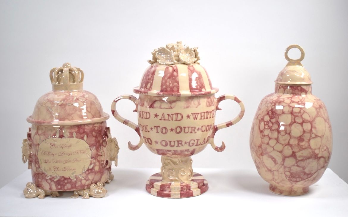
Before the Georgian era, decorative ceramics had been only for those with cash to spare. Now they were inexpensive and, ever canny, Sunderland’s factories soon tapped into trends. The poems of Byron and Burns appeared on china. And the many sailors in the north east could buy souvenirs of home, showing local landmarks as well as talismans for safe passage with transfers of ships in full sail, or tokens for their sweethearts. For the pious, there were plaques bearing fire-and-brimstone slogans in thunderous type – ‘Prepare to meet thy God’ was a favourite.
Such a plaque was the first item collector Stephen Smith bought over 20 years ago, amused by its morbid religiosity and drawn to the striking lettering. He now owns thousands of pieces of 19th-century pottery and runs two websites dedicated to Sunderland lustreware – Sunderland Pottery (sunderlandpottery.com) and Mate Sound the Pump (matesoundthepump.com), the latter’s name taken from a common design for maritime plaques. For Stephen, the appeal of north eastern lustreware lies in its more spontaneous and painterly qualities. ‘Items often have inscriptions with names and dates,’ he says. ‘There’s a link to the people who painted the objects – in their unique hand – and the figures whose lives the objects commemorate.’
Architect George Saumarez Smith is also a devoted collector, captivated by the way Sunderland lustreware seems to capture a moment in time. Drawing attention to popular combinations of ships and bridges with sentimental poems, which seem to reflect the frictions of Britain’s newly industrialised society, he says, ‘It is as if the pieces embody opposite sides of humanity.’
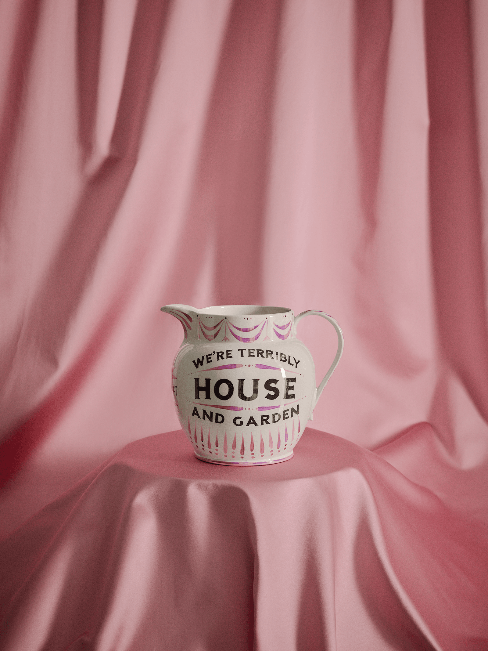
Sentimentality is often apparent. ‘Friendship, Love and Truth’, as some jugs espouse, could be seen as the 19th-century version of the dreaded ‘Live, Laugh, Love’. Yet somehow, such pieces avoid tweeness. Designer Ben Pentreath has collected Sunderland lustreware for 25 years and thinks it’s the folkier aspects – the nods to local identity and the naivety of some of the mark-making against the more refined imagery – that save it from mawkishness. It’s what the late Cecilia Alice Dunbar Kilburn, the champion of British craftsmanship and founder of 1930s London gallery Dunbar Hay, called ‘a wholesome vulgarity which is extremely attractive’.
.png)
.png)
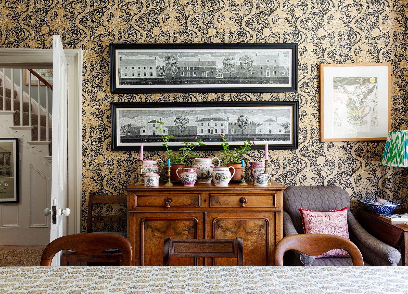
Rather than just admiring it, George uses his lustreware. Ceramicist Gloria Baker, founder of Sussex Lustreware, whose love of the pearly pieces led her to create her own modern takes, says these objects were designed to be beautiful and useful – ‘bread and roses’. People decorated their houses with them, but also ate off them and filled them with flowers in summer and tea in winter. Gloria suggests their perennial popularity comes from their presence in our collective memory, ‘Your grandmother probably owned a piece. Your local museum may have one. We’ve all seen them and know them.’
Gloria’s remakes are much sought after. In part, it’s for the way their tender inscriptions and simple imagery – including transfers of Eric Ravilious illustrations – speak to a nostalgia in design today, evident in renewed interest for work by the likes of Edward Bawden and Enid Marx. Gloria’s bestseller is a fat-bellied jug with the words ‘Take me to London’, originally made for a pop-up at Pentreath & Hall in 2022. Ben says of her work, ‘She gets the essence of lustreware just right – that perfect balance of whimsy and seriousness.’
.png)
.png)
Gloria is not the first to have reworked the form. Susan Williams-Ellis created a range for Portmeirion in the 1960s and, a decade ago, Emma Bridgewater made a version in a collaboration with Liberty. Vanessa Bell even had a go once. All this proves that time passes and lustreware endures, forever in the pink.
.png)
.png)


